They say that a user interface is like a joke – if you have to explain it, it can’t be very good. Kudos has recently launched a new user experience (going under the highly original, top-secret internal project codename “UX2”). Rather than explaining it, our Product Director, David Sommer, talks about what we set out to achieve and highlights a few features.
UX≠UI
Let’s start by differentiating User Experience from User Interface as these terms are often used interchangeably.
User experience (UX) design is the process of enhancing customer satisfaction and loyalty by improving the usability, ease of use, and the overall pleasure provided in the interaction between the customer and the product. It is about workflow, interaction, positive confirmation, reward and taking action. It is all about how the user FEELS.
User Interface (UI), on the other hand, is the graphical layer informed by the User Experience architecture, but based on branding/style guide and visual design principles. It is all about how the page LOOKS. Read more here.
Kudos recently celebrated its first birthday, and during its first year the Kudos publication page has remained largely unchanged. This is the page where authors can explain what their article is about and why it is important in simple language, and then enrich the article by providing links to relevant resources – setting the article in context. This helps readers find and understand their work.
Easy Does It
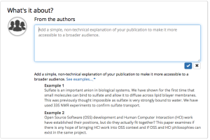
With UX2, a key objective was to make it easier for authors to add this information. Previously users had to fill this in using a pop-up form – not particularly friendly and not great on mobile devices. We now provide inline-editing tools, similar to the LinkedIn interface that our users are so familiar with, allowing them to add information and see how it looks immediately. As UX2 is all about user flow and simplicity, it then prompts the user to take the next step by moving them to the next section of the page for them to add more information. Kudos guides the author by the hand through the page, allowing them to see how their explanations are helping make their work easier to understand and find. We also provide examples and guidance right at the point the author needs it.
A New Perspective
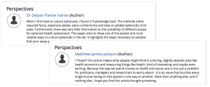
In addition, with UX2, we took the opportunity to introduce a brand new feature – Author Perspectives. This enables authors to add a personal comment about the publication in addition to “What is it about?” and “Why is it important?” The “Perspectives” field can be used in several ways; for example, to explain in more detail the importance of the publication to a particular group of specialists (rather than its general significance), or to give some background as to what the author hoped to achieve with the research and subsequent publication.
We have asked users for feedback, and so far we have had only glowing responses, such as this one from Graeme Day at the University of Southampton: “I like the new look, which is clear and easy to read. The in-line editing is an improvement – I tried it out on the paper for which I hadn’t added an explanation and it worked smoothly. The “About”, “Authors” and “Related Publications” tabs just below the publication information work well.”
As part of UX2 we also introduced a fresher look and feel to these pages, as well as the simpler language around the metadata added by authors (“What’s it about?” instead of “Lay summary”, and “Why is it important?” instead of “Impact statement” – this obviously reflects the overall spirit of Kudos to use plain language wherever possible).
We hope we have succeeded in creating a page that is attractive and uncluttered and at the same time easy to read and easy for authors to edit and add to. We will be rolling out UX2 across all pages of Kudos over the coming months.
Take a Look
Here are a few examples that you can look at; if you are an author, why not join Kudos for free and use the tools for yourself?
- California's coastal plants build sand dunes through teamwork
- Social strategies of baboons
- Spheroid health using volume, metabolism and enzymatic activity
- Chest x-ray interpretation by radiographers
- How not to bankrupt healthcare (and make our lives better at the same time). In 3000 words
As ever – we’d love to hear your feedback and suggestions. You never know, your suggestions might just end up in UX3. And that is no joke.


