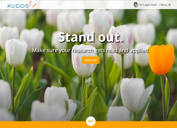
We are always working hard to make it easier for users to explain, share and measure the impact of their work on Kudos. We’re very proud of the positive feedback we continuously receive and we are always looking for ways to improve your Kudos experience. It’s been a busy few weeks and you may have noticed that there have been some significant changes, particularly with the new Kudos homepage, navigation bar and header.
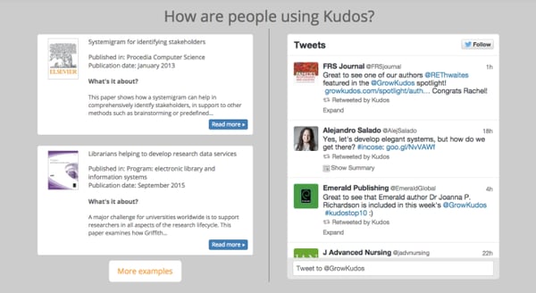
Our new homepage is designed to make it easier for those getting started with Kudos and ensure that the claiming, explaining and sharing of your publications is as easy as possible. You can see how people are using Kudos in the spotlight pages and the live Twitter feed.
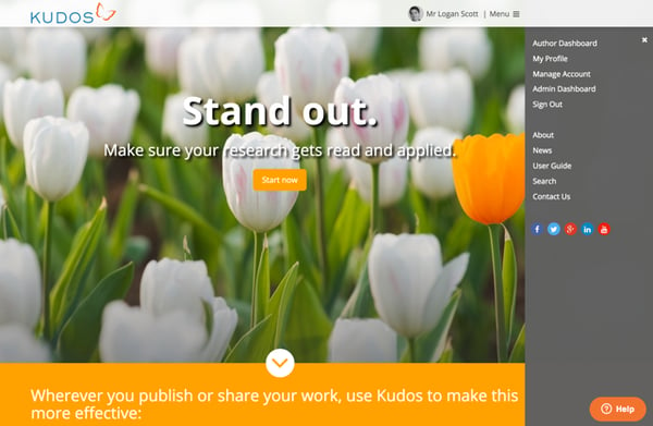
The new header and navigation bar is designed to help speed up your navigation of the website. No matter what page you are viewing on the website, the header is always visible.
From there, you can click on the menu button in the top right corner to open the side bar. Here you will be able to access your dashboard and profile, and quickly navigate to the ‘Manage Account’ page. We have also added a ‘search’ link in the menu, which enables a search bar for you to enter the name or title of your publication(s) you are searching. You’ll still recognise sections such as the ‘user guide’ and ‘FAQs’ which have now been combined into one page, making it easier for you to access this information.
We hope you like the new homepage and enjoy using the improved navigations.
The Kudos team will be working hard to bring you further enhancements to improve your experience with Kudos and make sure your research gets read and applied. We look forward to receiving your feedback!
If you haven’t already, sign in to your Kudos account or register here to get started.


