
I was delighted to be invited to speak at last week’s “Strategy of Impact” conference, organised by ResearchFish and Interfolio. My paper explored how we can improve research engagement and impact by capturing, analyzing and visualizing data relating to research communication and dissemination. My premise is that broader impacts are derived in part from broader engagement of stakeholders – which boils down to communicating research to the right people, through the right channels, in the right formats, at the right time.
With traditional research communications tending to be quite broad brush, and such a range of different communication activities and channels at our disposal, we need to take a more data-driven approach – tracking which channels and activities are most effective for reaching target audiences, and investing available time and budget more efficiently on this basis.
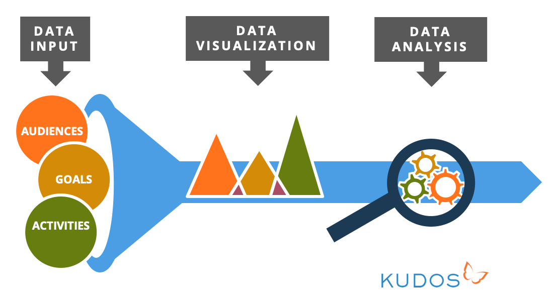
Data input
First of all, we need to capture information about the audiences being targeted by a research group, project or department – for example, policy makers, educators, practitioners, the media, funders and industry.
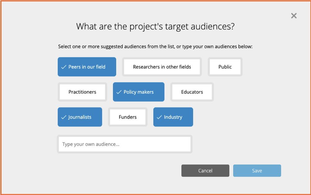
This is a screengrab of the planning wizard in Kudos Pro that takes researchers through the process of putting together a communications plan, and this is the first data point it captures along the way. (Got to love the beautifully simple, “faculty first” UX here, right? Hat tip to our amazing designer, Reut!)
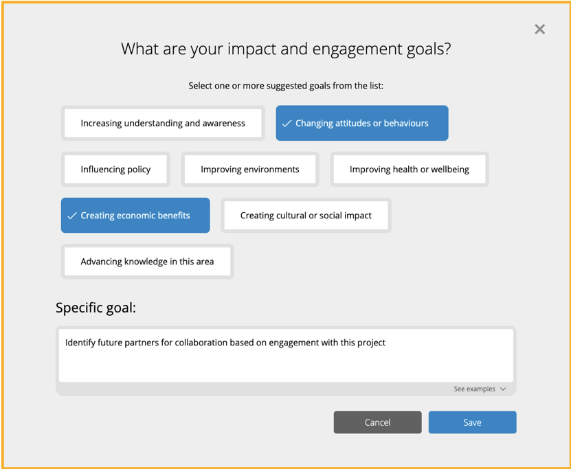
Then we can capture information about a project’s engagement and impact goals, for example, changing attitudes or behaviours, influencing policy, improving health or wellbeing, improving economic outcomes, and so on:
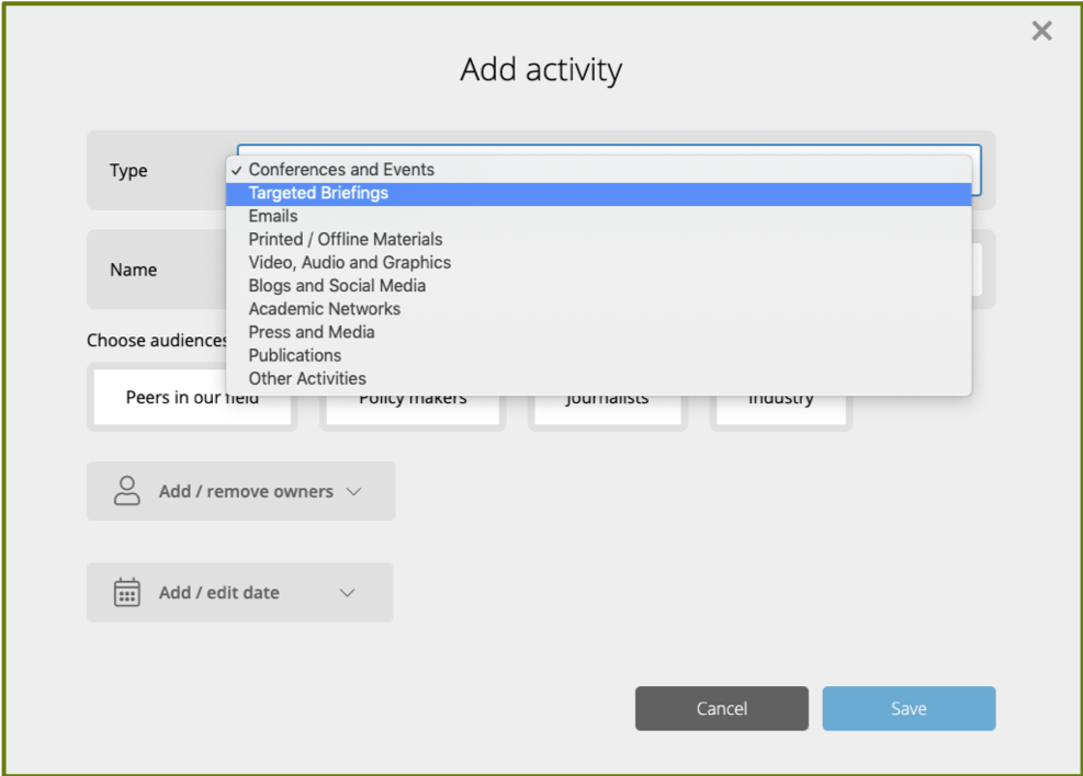
Next, we can capture and categorize the activities that the researcher or group is doing to try and achieve those goals. Really key to this is capturing data about offline activities as well as online activities, as so much engagement and impact is driven by more traditional offline methods.
You need to be capturing and tracking those activities to give a comprehensive dataset and ensure that any data-driven recommendations in future are based on a comprehensive data set, and not just a partial set of the sort of easy-to-capture digital data points, because they obscure the reality of how most engagement is done and therefore what it is that really drives impact.
Data visualisation
Putting these data together can help ensure research is much more efficiently and effectively communicated to maximize impact. But just having the data is not enough, of course. We need insights to be drawn out of it. The next step, therefore, is to visualize data so that the things it has to tell us start to leap out at us. In Kudos Pro, for example, we track all the different outputs from a research project on a like for like basis, to be able to then get a sense of which of these is most effectively engaging target audiences.
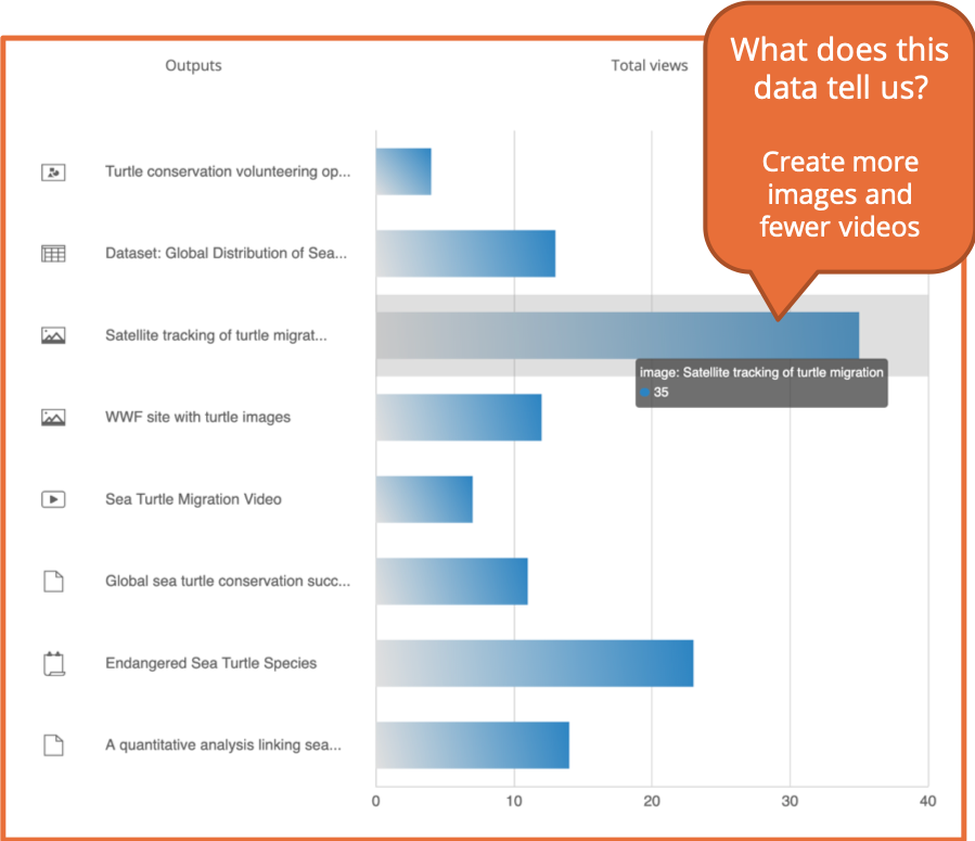
Here you can see that it is an image showing satellite tracking of turtle migration that is substantially the most viewed of all the different outputs for this project. Again, both online and offline outputs are being tracked here – so you can see that engagement with an academic poster about the project is being counted alongside a video, some data and so on. This means that the relative expenditure and “return on investment” of each of those activities can be consistently compared, and valid conclusions can be drawn about which activities we should do more or less of.
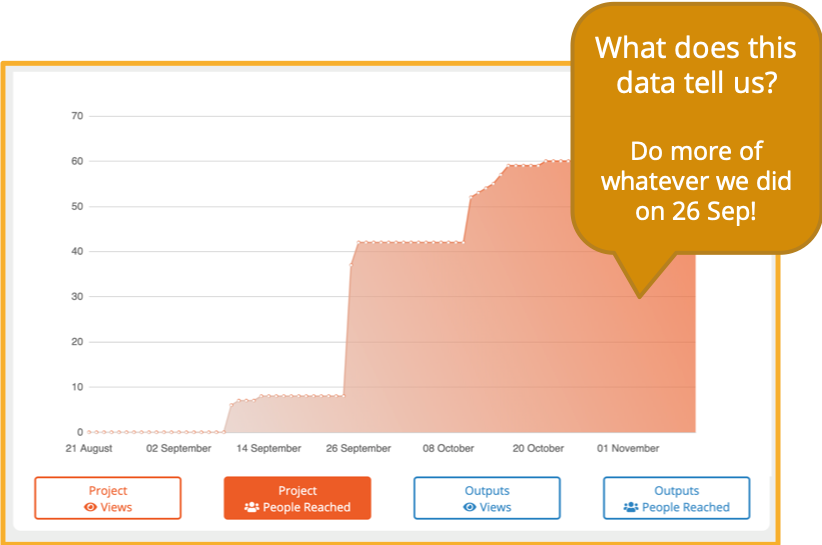
It’s also useful to be able to visualize data over time. This makes it very clear if one of your communications activities has led to a sudden jump in engagement like we see here – which might make you think – ok, we’ll do a bit more of that, or we’ll use that approach again in a future project plan. So in this case, the researcher will be thinking, we should do more of whatever we did on the 26th September!
Of course, you’ll be thinking – well, OK, but what did you on the 26th September? So, obviously, as well as visualizations, you also need ready access to the data behind the graphs, so that you can check that and say, ah right, on the 26th September, you were at a workshop, and of the things you did for that workshop, you can see whether it was your poster, your talk, your handout or your tweet that really generated the most engagement.
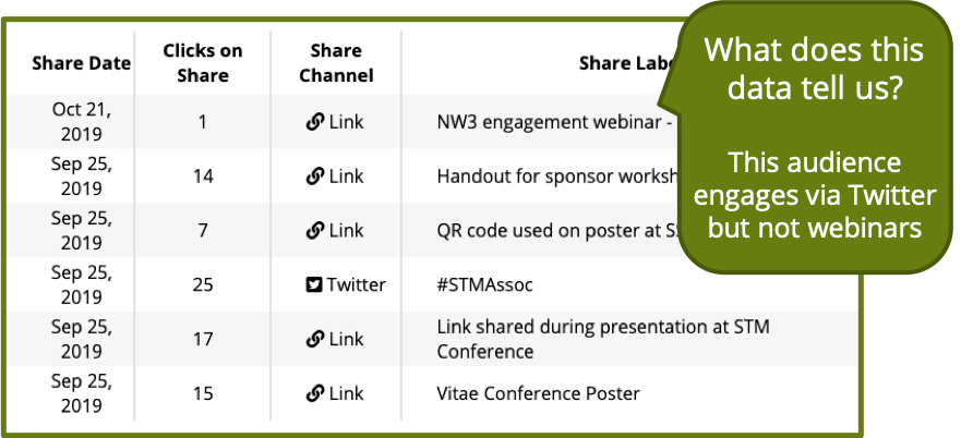
This screengrab shows how Kudos Pro tracks all your different activities with labels that help you evaluate as the project progresses, or for the final reporting - or to inform the plan for the next project.
Convince your supervisor who thinks Twitter is all about cats and breakfast, that actually it does have a valid and worthwhile role to play in communicating research.
Capturing this data is not only about informing decisions about how to engage audiences, but also then being able to defend those decisions, and maybe argue the case with sceptics in an informed and evidence-based way – so in this case, it looks like the Tweet is what brought most people to the project page, which might help you convince your supervisor who thinks Twitter is all about cats and breakfast, that actually it does have a valid and worthwhile role to play in communicating research. But similarly here you could show that more established approaches like speaking at a conference are also proving to be effective and so they are still worth the not insignificant costs involved. Whereas the least effective channel here has been a webinar, so maybe this target audience doesn’t engage well with that kind of communication, and for this project, it’s not going to be a realistic alternative to in-person presentations; it isn’t going to be worth the subscription to the webinar service or the effort involved in training this research group in how to use that toolkit.
Analyzing data
Visualizing the data helps individuals and groups to make informed decisions about very specific projects and activities, and helps you learn lessons about how you can maximize engagement and impact with your target audiences. To be able to learn those same kind of lessons at scale, we need to progress from visualizing data to analyzing the entire data set of all researchers’ activities and results.
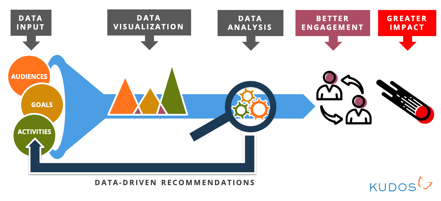
Building a huge dataset, and undertaking analysis of that, is what is happening in the background of Kudos Pro, enabling the intelligence derived from project-level engagement to be rolled up and interpreted so that universities can give researchers much better guidance about how to engage audiences and maximize impact. By better guidance, I mean clearer, more specific, more appropriate, more effective, and more efficient. Imagine you’re the knowledge exchange lead, and a researcher asks you what they should do to maximize engagement with their project – targeting head teachers of schools to encourage more exercise during break times. You can go to the data, and plug in the audience and the impact goal, and get a set of data-driven recommendations out, for them to put into their grant submission or their project plan. “This is what other people doing similar work with similar target audiences found effective as a way of communicating their work."
This combination of data driven recommendations at both the macro and micro level is what helps us, as a community to become better at research engagement – choosing our engagement activities in a more strategic way, saving time and money from activities that aren’t effective and don’t need to happen, and ensuring that those activities that we do undertake, do the best possible job of reaching and engaging target audiences. Because it is through effective engagement that we can maximize uptake of the research and ensure that as many people as possible find, understand, apply and build on it – delivering greater impact. And as well as helping maximize the impact, capturing data along the way also makes the process of identifying and evidencing impact more effective, as you have a kind of “breadcrumb trail” to follow, from the work, through the engagement, to the impact. By understanding where the engagement has been greatest, you can refine and focus your efforts to identify and evidence the impact.
In conclusion, capturing retrospective metrics about the performance and impact of your work doesn’t help to actually improve performance and impact. You need to take a much less passive approach, proactively planning and logging engagement efforts, if you want to broaden the impact potential of your work.
